Colour of the Year 2026
As we enter another new year, Guy Hubble, joint managing
director at RegaLead talks about the return to neutral.

After 25 years of dramatic shades, jewel tones and warm neutrals, Pantone’s colour of the year for 2026 is… white.
I watched, bemused, as my marketing and graphic designer contacts on LinkedIn asked if they were being trolled after the global leader in colour expertise named Cloud Dancer as its chosen shade.
‘A lofty white that serves as a symbol of calming influence in a society rediscovering the value of quiet reflection’, Pantone said. It described Cloud Dancer as a ‘key structural colour whose versatility provides scaffolding for the colour spectrum, allowing all colours to shine.’
It’s a statement which feels like a bit of a contradiction – what is the point in naming a colour of the year that only exists to support other colours? But on the other hand, it did create a nice basis for them to launch no less than 7 complementary palettes, each with 8 colour shades. So, there are, in fact, 56 Pantone Colours of the Year!
But back to Cloud Dancer. It is a good reminder to us in the world of colour that white is still very much alive and well.
The Autumn 2025 edition of Keystone Market Research’s UK Consumer Fenestration Trends Report said that white is still the top window colour choice for 51 percent of homeowners. After white, the top colour choices cited were neutrals: dark grey, mid-grey, dark brown wood effect, light grey, and light brown wood effect.
Meanwhile, the recently released 2025 Annual Colour Trends Survey, from software specialist Tommy Trinder, said that 62 percent of uPVC casement window quotes created using their system last year, were for white. But whilst white is still dominating, other colours are taking more market share. Anthracite Grey accounted for 10 percent of quotes, Agate Grey 4 percent, White Woodgrain 4 percent, Cream 2 percent, and a further 4 percent was taken by other grey shades.
It shows that a neutral colour choice doesn’t always mean standard shiny white plastic and how far we have come since the ‘white gold’ days of the ’80s and ’90s. Foiling and coating technologies open-up a world of shade possibilities.
Whilst white still leads the charge on colour for windows, front doors are a different story and homeowners continue to be braver with their colour choices. Only 18 percent of homeowners named white as their top door colour choice in the Keystone Market Research report, meaning 82 percent would be eager to make a colour statement with their front door.
Perhaps that puts our industry in the same camp as Pantone this year – using a neutral as our core colour for windows as the ‘scaffolding’ whilst making colour in the front door the main event. What’s clear though is that there is a bigger-than-ever appetite for colour in windows and doors and presents a clear opportunity.
So how can installers really capitalise on colour? When helping customers choose the best colour for their windows, it’s a good idea to use product visualiser software systems. Seeing how each shade looks on their property can create a great colour upsell opportunity and they often create clean and professional quote documents too.
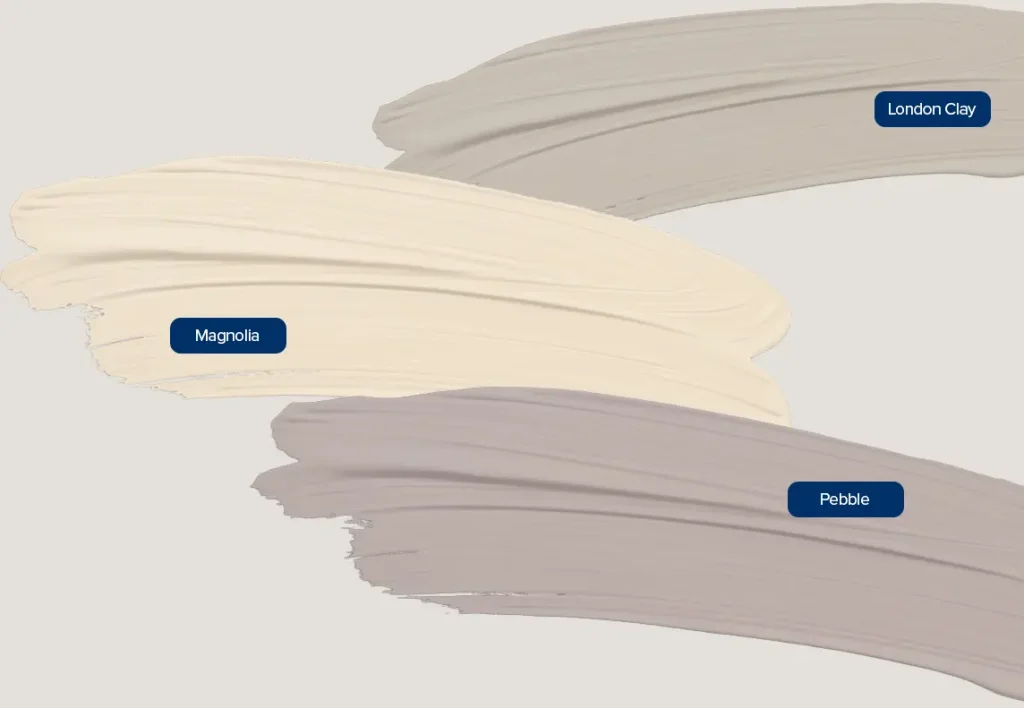
Crucially, don’t place limits on your colour range. Even the subtlest of colour differences can have a huge impact on the final window aesthetic. Just our standard ColorSpray shade range features more than thirty neutrals, from off-whites to creams, beiges, taupes, and soft greys, and they all sell.
If the
research
and data tells
us anything, it’s that
no single shade will take over from white,
but windows in any colour other than smooth
white will take market share. It might be a
subtle difference in choice, but it opens the
door to bolder shades for products like front
doors. So whilst Cloud Dancer may have
rocked boats in the design world, it’s safe to
saythat neutrals are a driver for change in
the colour market and that’s an opportunity
that installers can’t afford to miss.